Samsung Galaxy S25 Ultra mock-ups by Ice Universe show slightly rounded corners | Infinium-tech
Samsung has kept a fairly consistent design for its premium S-series, although each year it makes a few changes that try to improve the look and ergonomics. They have had varying success. The Galaxy S Ultra in particular has settled on a rectangular design whose sharp corners look stylish but actually dig into your palm. The Galaxy S24 Ultra might be the worst in this regard – here’s a 3D view of it next to the S23 Ultra.
Samsung may finally be changing its ways and moving towards a round design. Famous leaker and vocal critic of Samsung Ice universe has shared these mock-ups of the upcoming Samsung Galaxy S25 Ultra.
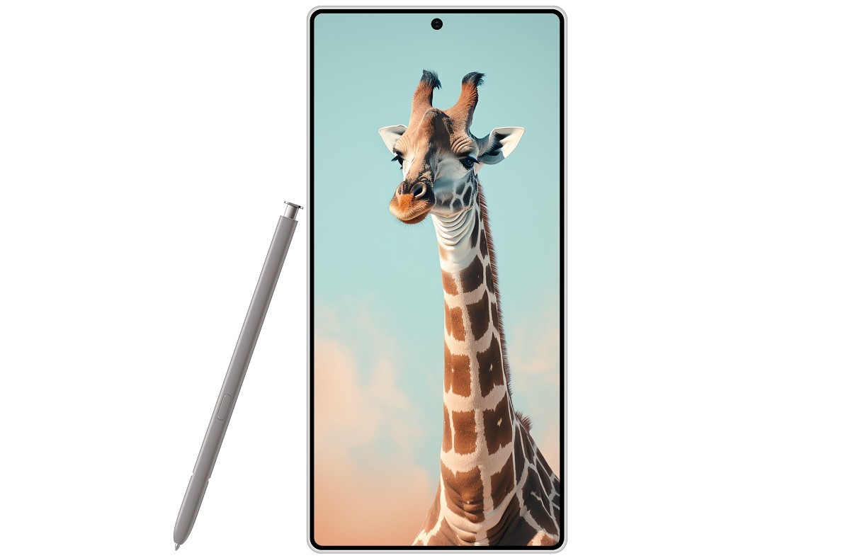
Samsung Galaxy S25 Ultra mock-up
It is true that corners are no longer 90° angles. For some time snow The S25 Ultra is said to have a design close to that of the S24 and S24+. This means the front and back will be flat (at least flat).
There could be some asymmetry to it – maybe the back is more rounded than the front, softening the shape of the phone and making it more pleasant to hold.
Here are some hypothetical comparisons with the current Galaxy S24 Ultra and the upcoming iPhone 16 Pro Max. The new S-flagship has rounded corners – both on the frame and the display – and this is quite noticeable next to its predecessor. However, next to the iPhone, the new Ultra still looks quite rectangular.
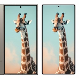
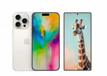
Mock-ups: S24 Ultra vs S25 Ultra • iPhone 16 Pro Max vs S25 Ultra
What do you think – is this the right direction for the next Ultra?







Leave a Reply